It is really cute!!! 10/10. would pet


 Senior Member


It is really cute!!! 10/10. would pet
Senior Member
also, logo for 2014:

rabblerouser
Much nicer than the first.
(the previous comment was not directed at any particular individual and was not intended to slander,disrespect or offend any reader of said statement)
BF OG
Someone gave that kitty antifreeze...it's tongue, nose and eyes are green.
NSFW
This is going to be the logo badge thing on the field I think:

NSFW
I think they should've gone with this one personally:

Cult Figure
I dont know what the old one looked like. This looks the same . I guess I never payed much attention to their logo. I like the one with the claw. Thats cool
rabblerouser
There is more detail to the eyes and ear... as well as different spots. Its a much nicer looking logo than the previous oneOriginally Posted by Dzone

(the previous comment was not directed at any particular individual and was not intended to slander,disrespect or offend any reader of said statement)
NSFW
The old one looks like it was made in 90s and that is not a good thing. New one is much more modern and sleek.
Senior Member

It's more lifelike. The last one had rounded ears and was very looney toons-ish.
*The statements above are my opinions, unless they are links, because then they are links, which wouldn't make them my opinions, and I suppose stats aren't necessarily opinion, but they are certainly presented to support an opinion. Proceed accordingly.
Senior Member
*The statements above are my opinions, unless they are links, because then they are links, which wouldn't make them my opinions, and I suppose stats aren't necessarily opinion, but they are certainly presented to support an opinion. Proceed accordingly.
whatever?!?!?
Weren't you made in the 90s?
rabblerouser
Our Bronco's logo was made in the '90s
(the previous comment was not directed at any particular individual and was not intended to slander,disrespect or offend any reader of said statement)
whatever?!?!?
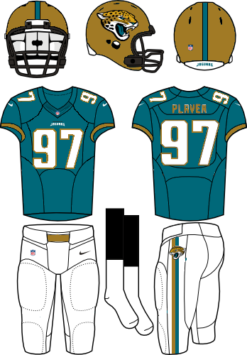
I like our logo. Still don't like the unis, but the logo is good.
Senior Member
I think it would be cool if Jacksonville went kind of old school with new unis.
Forgive my rudamentary work in my new program, which everyone will love...GIMP 2.
I don't have access to photoshop anymore...
*The statements above are my opinions, unless they are links, because then they are links, which wouldn't make them my opinions, and I suppose stats aren't necessarily opinion, but they are certainly presented to support an opinion. Proceed accordingly.

There are currently 1 users browsing this thread. (0 members and 1 guests)
 Posting Permissions

 Reply With Quote